Creating A Youtube Account


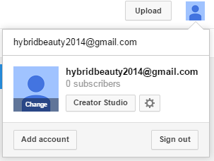
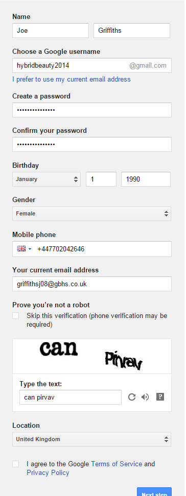
This is how we created out google account for our band and then from this we were able to make a youtube account for our fans. This will be displaying everything to short vidoes about the band and the completed new music videos. As you can see we started off with no subscribers but this will quickly change once we have uploaded our footage onto their and updated out channel more. 

I had to edit the page from when it was made because it was originally in my name and had to change is so that it made it clear that it was for our Hybrid Beauty page. 

Here is what our homepage looks like so far, we haven't uploaded anything on their so far.

NME front cover ideas


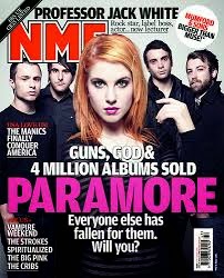
Here are 3 examples of NME covers which I have looked at in order to base my front cover idea on. I have noticed that in most of them their is a large focus on the front cover of the star centralised with the other information that appears written around them in a white font. The main story is usually in a different colour in bold. The NME is always in the top left corner in bold usually in either red or white writing.

Digipack front cover


Digi Pack Planning Continued


Nme Radar Articles


 We are going to use these articles as a template for what we want ours to look like, these are slightly smaller radar articles in NME. This will be most appropriate as our group is an up and coming band.


Audinece work

: http://www.powtoon.com/show/fzy2o1MLWot/hybrid-beauty-audience/

hybrid beauty fonts


Institutions

Talent Record companies want big, fast, safe returns on their investment Always start with continually refining and perfecting your talent Product Find a demo studio Always be sure how many hours you need before you book it Placement Find an online home for your recording A website or a blog It's about marketability and presentation Promotion Build a fan club Start with Facebook, connect with smaller, local radio stations Transition Natural culmination of doing the first four steps really well Don't get it perfect - just get it started 
Source: http://EzineArticles.com/?expert=Ruan_De_Lange
 What record companies might sign us?


1) 4AD
 Year Established: 1979
Genre Focus: Underground American Rock, Electronic, Indie Pop
Website: www.4ad.com


How is this website useful? Sophisticated, clear lay out 'Latest news' section, keeps audience members up to date Music samples at the side, opportunities to listen and show interested Headers to other page links at the top, lots to look at

 2) Rough Trade Records


Year Established: 1978
Genre Focus: Post Punk, Indie Pop, Underground Rock
Website: www.roughtraderecords.com

The story of Rough Trade Records is an oldie but a goodie. In fact, the label itself is one of the oldest on our list, dating back to the dusty year of 1978. Prior to its inception, founder Geoff Travis successfully promoted and sold records by a number of punk, very early indie pop, and early post punk bands like The Smiths and Buzzcocks. At the time, Travis was also operating a record shop off Ladbroke Grove in London by the same name. This combination of a retail storefront presence and promotional experience ultimately led to the Rough Trade Records label. Once established, the new platform quickly setup a distribution arm that would service independent retail outlets across the UK, a network commonly referred to as the Cartel.


How is this website useful? Cool picture collage at the top News section, keep audience members up to date 'Sign up' section, opportunity to receive news etc YouTube links, new music they are interested in
Potential DigiPack Ideas


We looked at images from our photo shoots as potential images for our digipak. From our images, these two were our favourites. The first image looks like a selfie, which makes the image feel a lot more personal, however, it doesn't fit in with the genre specifics, which are usually clean cut close ups, or wide shots showing natural scenery. The second image is very dark, and shows the band on three separate levels. The group doesn't seem very together, as the band is standing physically quite far apart, however it fits in more with the genre specifics than the previous image. If we were to use either of these images, we would use filters to accentuate the moods of the image, i.e. the first being light and carefree, and the second being dark and mysterious. We would also use font in an outlined box, similar to The 1975 and Troye Sivan's style. Ideally we would only have the bands' name written on the front cover, as it is a self titled album. We decided the below font would work best for the image we were trying to display, as well as working within the style we wanted to use.

Playing with More filters in premier

Playing with FIlters in Premiere Pro
Emma played around with a different filter to possibly use over our video. underneath are the before and after pictures of the effect. I think that we should have toned down some of the scratches as they come across quite exaggerated, but I liked the over all look this effect gave, and I think it will work once we fiddle with it until we are happy.


Working On The Website


Here shows me editing the website and making it look more 'our style'. We thought that this picture worked really well with the website lay out, as it is a natural shot of us just talking and laughing. The dark purple filter, light pink text, and black background all work together, and is starting to being together our image.

Digi pack planning design 2


The text reads:
 Front Cover
 Photograph of band
 only two fonts used throughout:
band logo font
body font

 Back Cover
'cracked' background
institution
 track listing
soft pink and white writing
pink track listing
white title

 Front Inside
 message to the fans
photo of band
edited messages
(the band will personally write these)

 Back Inside
CD lives here
Image of band facing sea
photo shopped image

Teaser Trailer

Digipack Planning


The text reads:

 THE FRONT COVER:
 Here, there will be font reading 'Hybrid Beauty' - our self titled album
Also, a box may appear on the front cover reading: "Includes the hit single BLACK BEAUTY

THE BACK COVER: This will include the track listing for our self-titled album in the center of the back of the case.
The tracks will be un-numbered as inspired by albums such as Lana The back will also feature mentions at the bottom such as executive producer and also, our record companies logo
Track listing examples: "Electric Believing", "Polaroid", "RayBan Cadillac" and "Peroxide of the Diverse"

THE CD:
The CD itself will have text in similar font to the front cover on a matte black CD
Our record company logo will also feature here

CD BOOKLET PLANNING: The booklet will include information about the band, collage images from associated photo shoots and lyrics from our songs
The front of the book will be a picture of the band (undecided) and on the back, copyright conditions

Haim NME articles


Tasks We Need To Complete

- Everyone have a go at editing (all of us)
- Digipack planning/ name of album (Beth)
- Another photoshoot (monday) All wear black, in the recording studio with instruments. (All of us)
- Work on website/ wix (Joe?)
- Article - Radar NME (Joe)

Emma experimenting with filters


Here Emma has done some work on our music video just playing around with some of the filters on adobe premier, we as a group decided to do this because our video needed some exciting effects in it to make it more pleasing to view.

Evidence Of Filming

Here are pictures that we have taken from when we were in Southend which shows evidence of us filming in lots of different locations throughout the day. 

We have taken a number of different types of shots including close ups and tracking shots as you can see in the above and below images. 


Editing Progress

This image is an update on how far we have got as a group with completing the editing for our music video. We still have a bit to do but it is proving challenging at the moment due to school issues.

Audience Feedback

We would be very greatfull if you would be able too fill out our questionairre
https://www.surveymonkey.com/s/MGK9NMJ

Album Cover Trial Designs


This is my first design for a digipak cover. The image is very light, and mostly shows shadows on our clothes. I like this album cover due to the high contrast of the font and us against the background.

This is an image from our first photo shoot. It depicts the bands standing together in black and white. I don't really like this cover, as we look quite far apart from each other, which makes us feel like we don't really look like a band.

This is my third design for a digipak cover. I quite like this design as its quite dark, which matches the sound of the music we make. However, it doesn't correlate with the band's image, which is supposed to be friendly and very approachable.